Aug 15 2014
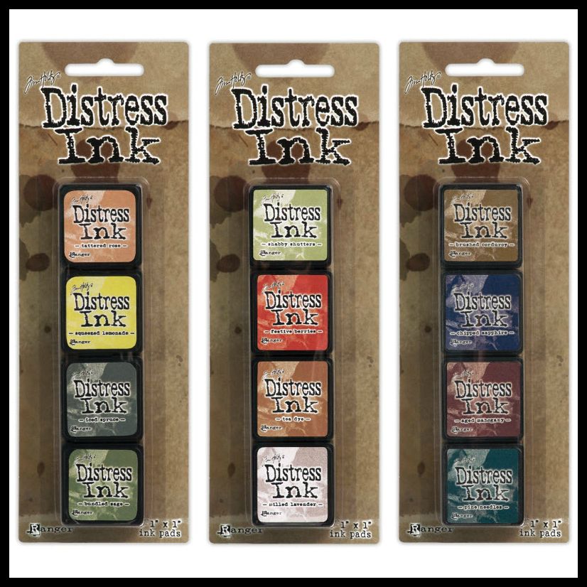
Mini Distress Sets 10-12
Woohoo!!! They are here… the completion to these ADORABLE Mini Distress Inks. Sets 10-12. So happy that they are now available in all 48 colors.
Thanks to Tim Holtz and Ranger, I am able to give one set away! 🙂
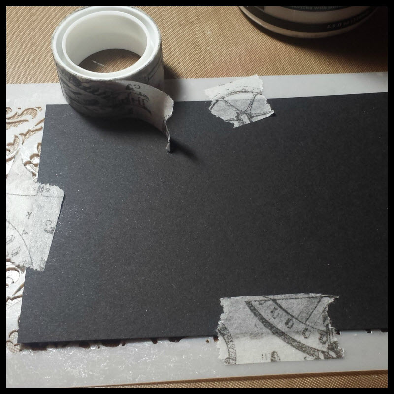
For the card I created, I wanted to play with the Ranger Texture Paste since one of the properties I absolutely love-love-love about it is that it is inkable.
I didn’t want my paper to move around when I applied the paste, so I used Tissue Tape to temporarily adhere my black cardstock to the back of the stencil.
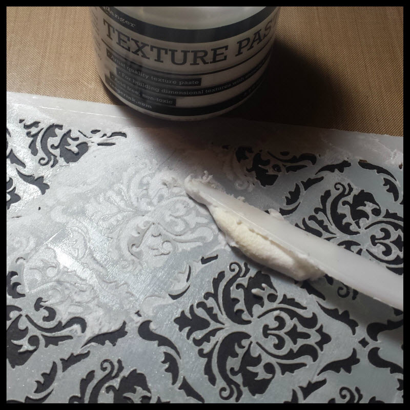
I flipped it over and applied the paste to my (current) favorite stencil… Gothic. I use the back of the palette knife to apply the paste. Spread it all over like you are frosting a cake. (I hear that’s how you frost a cake anyway… I’m not much help in the kitchen… well, except help EAT the food 🙂 )
I seriously love the magic that happens when you lift that stencil up to see the gorgeous pattern.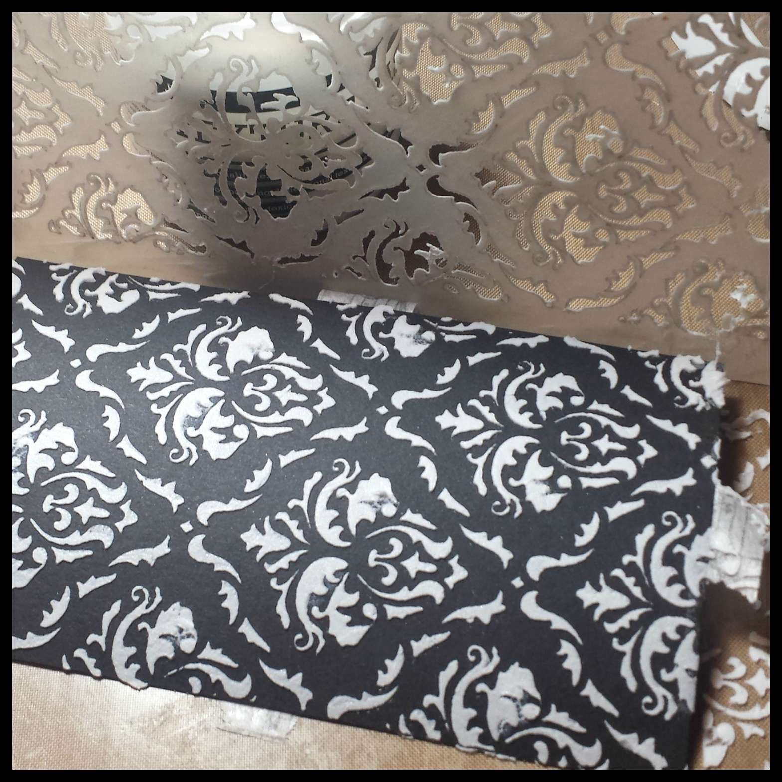
Then, I took Milled Lavender and applied the ink directly onto the paste. I did the same with the Tattered Rose, Chipped Sapphire and Shabby Shutters. After the ink was down, I used my mini ink blending tools to blend the colors around the pasted pattern. (I got so excited that I forgot to take a picture of that step)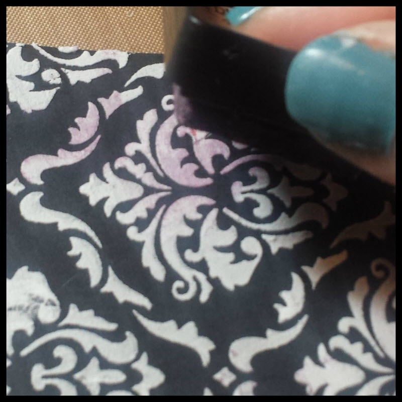
I stamped one of the quotes from Attic Treasures in Shabby Shutters and lightly “kissed” certain parts of the stamp with the chipped sapphire.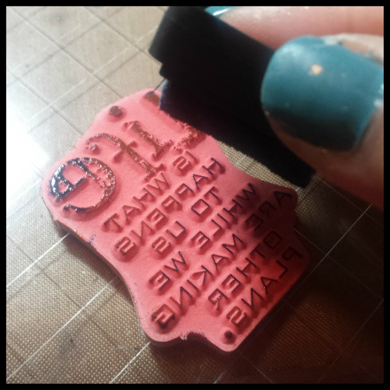
I love how the two colors go so well together.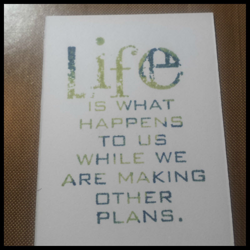
And I HAD TO add perfect pearls to the project… It’s my latest addiction. My stamp-a-stack girls (or stamp-and-snack as tim thought it was called) can attest to my obsession. 🙂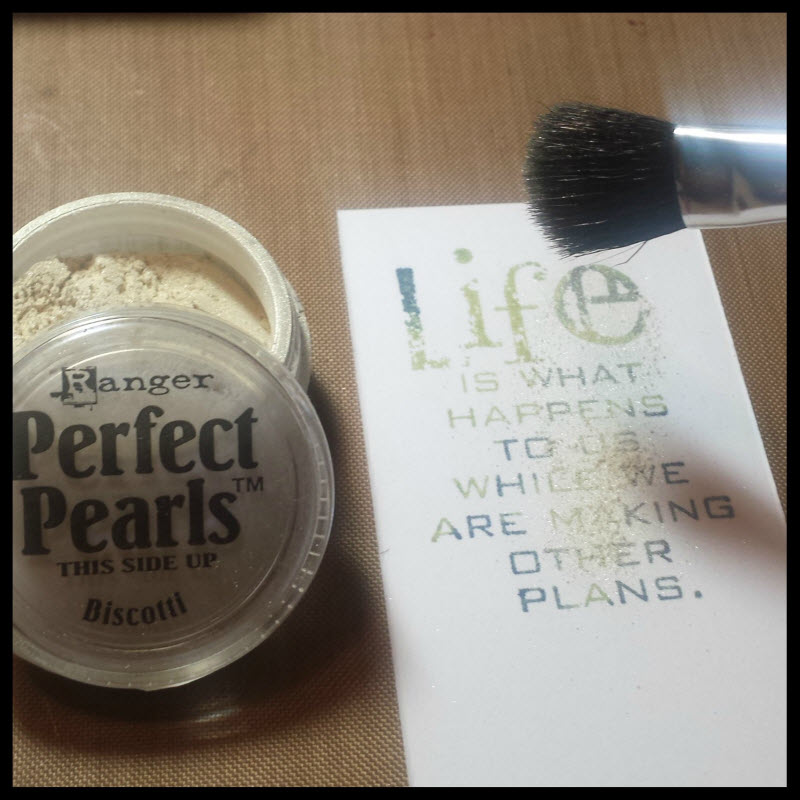
It’s hard to capture the pretty pretty shimmer that it adds to the project….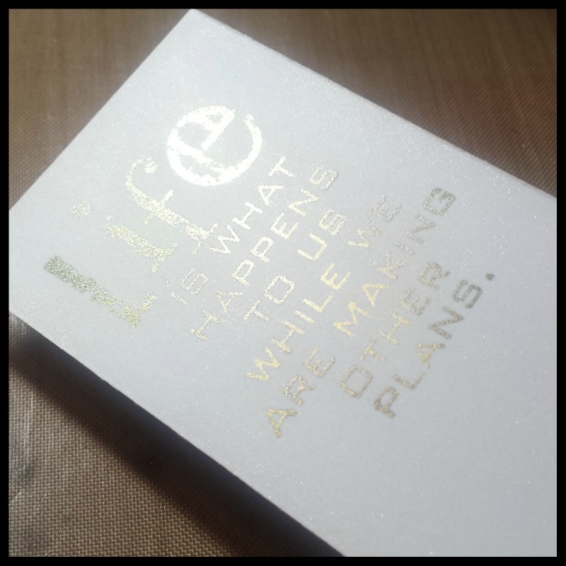
I inked the edges with Brushed Corduroy and put it on black cardstock for matting. I attached a hinge clip to the top of the quote.
I applied all of the pieces, as well as the wordband (that is adhered with the linen ribbon) to Neenah Desert Storm Cardstock.
And here it is all put together. I loooove the INKED textured paste.
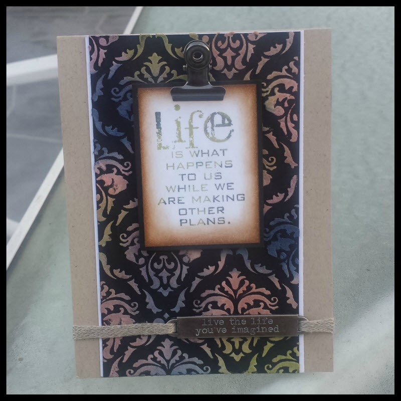
One thing I loved about making this card is that I stepped out of my comfort zone when it came to color combination. I seem to always reach of the same colors for most of my projects. But, it was fun playing with other colors.
Please leave a comment and tell me what your favorite color combos are for a chance to win a set of the new mini distress inks. 🙂 I want to try some of your new color combos.
Thanks so much for stopping by!
~joy
367 responses so far


[…] mcguire – paula cheney – wendy vecchi – richele christensen – shari carroll – tammy tutterow – joy kennedy – may flaum – chelle […]
I have never used texture past before and it looks beautiful, but what I REALLY am dying to try are the 2 colors you have used together to stamp your phrase-the SHABBY SHUTTERS and CHIPPED SAPHIRE-I love the combination! We have been fortunate to be blessed with our first grandchild, a little girl-Kinley Grace- July 20th- and I have a picture of her covered in a spearmint colored blanket that I think would be perfect for this project!!!
Fabulous. So lovely to have them all now!!
Great things come in small pkgs. Wonderful Mini Distress Ink. Like the creativity with the colors & shine of the embossing. Thanks for giveaway chance. Please sub the symbols for the words in parens & no blanks:
sunshine_honeybee2004 (at sign) yahoo (dot) com
Melissa
“Sunshine HoneyBee”
I love Tumbled Glass, Faded Jean and Dusty Concord! I love blues and purples.
Thanks for sharing your ideas. I would love to win the mini’s. Linda from Alaska
Your card is outstanding! My favorite combo is Broken China, Vintage Photo, and Peeled Paint. Thanks for the chance to win!
Lately I’ve been using tumbled glass, peeled paint and squeezed lemonade. Hangin’ on to those summer colors!
My favorite is squeezed lemonade and peacock feathers together. 🙂 So summery.
Wonderful project! Distress inks are so fun, seems like they all work together. A new combo I tried is Wild Honey, Peacock Feathers and Peeled Paint. Thanks for the tut and contest! ~kim
blueroseblogger at gmail dot com
I love the background.. I’m going to have to use that one 🙂
I love the card.an easy technique with beautiful results!
Beautiful card! Love the technique! My fave DI combo is Picked Raspberry, Salty Ocean and Mowed Lawn…and of course all the rest of the DI colors. 48 colors can be a combo right?
Love your beautiful design!!
I love peacock feathers, ripe persimmon and squeezed lemonade, gorgeous colors!!
Beautiful! I enjoyed seeing the technique with the texture paste. I like Tea Dye & Pine Needles together.
Love the stencil and paste background, thanks for sharing! 🙂
What a fabulous make, love how you’ve used those perfect pearls. thanks sooooooo much for the chance of winning a set of the inks
Sam xxx
sam21@ntlworld dot com
Mooie kaart met de pasta en dan de inkt.
Ik houd van verschillende tinten in een kleur te gebruiken.
Voor de kleintje meer in primaire kleuren.
Ik deze inkt ook in Holland te koop, want ik kan hem nergens vinden.
Met andere inkt soorten gaat het lastig dat mengen.
AJ
I love shabby shutters and so thankful that it is coming soon……peeled paint , squeezed lemonade and peacock feathers are the ones that i use now……. I just love how they look all together and doing water coloring with them is so much fun …thank you for a chance to win…..
marie
I love shabby shutters and so thankful that it is coming soon……peeled paint , squeezed lemonade and peacock feathers are the ones that i use now……. I just love how they look all together and doing water coloring with them is so much fun …thank you for a chance to win…..
have a great day 🙂
This is beautiful Joy ! So much inspiration ( you gonna make me dig out stuff); love the perfect pearls !
I’ve been playing with frayed burlap, iced spruce, wild honey and peacock feathers … fun combo ! But you know I love all these colors. Trying to get out of my comfort zone too !! 🙂
Love it!!!! that texture paste is great stuff too. =)
I love your card, so inspiring! My favorites are Vintage Photo, Broken China and Peeled Paint.
Love the card! Great layout and that stencil sure is fun!
I have a small collection of distress inks so far. I’ve been combining peacock feathers, mowed lawn, and salty ocean a lot. Really love how they all blend together to make a nice gradient!
The background colors are excellent!! Iced spruce/Dusty concord/Antique linen color combo. Mini distress inks are the best! They’re so versatile and cute.
Hi Joy. Love the card. Right now I have been using bright summer colors: barn door, picked raspberry & spiced marmalade.
beautiful Joy!! I LOVE that stencil! it’s gorgey!
TFS 😀
So sorry…forgot!
favorite color combo at this very moment is …dried marigold, shabby shutters, peacock feathers and festive berry.
Love that you showed all the steps – the inked paste is a lovely technique! Thanks for the chance to win!
Completely forgot to include my favorite color combo. At the moment I love Peacock Feathers, Dusty Concord and Mowed Lawn – it’s cool and bright.
Cheers pal. I do apcpireate the writing.
Yo, that’s what’s up truthfully.
I might be beating a dead horse, but thank you for posting this!
Mighty useful. Make no mistake, I appreciate it.
I found just what I was needed, and it was entertaining!
Kewl you should come up with that. Excellent!
Please teach the rest of these internet hooligans how to write and research!
With the bases loaded you struck us out with that answer!
I’m not worthy to be in the same forum. ROTFL
It’s imperative that more people make this exact point.
I like blue, purple and green combinations and Tim Holtz distress inks have some very nice colors. I’m happy that the new minis are being released 🙂
Thanks for the chance to win a set. I love the blues, greens and pinks and purples.
I think any combo of them work great.
Beautiful Card.
Love the colors that you used for the background…so pretty…the sentiment is great with the colors and pearl powder…great job!
I love the inked paste too, Joy, the card is gorgeous!
Oh, do I love the texture paste on that black background! I need to get me some of that! My favorite color combination that comes to mind is tattered rose and frayed burlap. I’ve used it several times and it results in the perfect vintage pink!
Correction! The combination is Victorian Velvet and Pumice Stone not the one I listed above. The one listed above is the one that Tim used on the June 2012 tag and I didn’t have those colors so I had to substitute. That’s how I discovered it!
Hi Joy – Love the card. Some of my favorites are Milled Lavender, Dried Marigold and Scattered Straw. Thanks for the opportunity to win a set.
In the summer-seedless preserves
Mowed lawn and squeezed lemonade
I love blues and greens. I like Broken China and Peeled Paint together.
The inked texture paste background looks fantastic, such a stunning and classy make! Very elegant and beautiful! ( Tim’s Stamp and Snack brought a big smile to my face…:0)
Love the card! Love combining Mustard Seed, Shabby Shutters and Spiced Marmalade together.
So happy that all the colors are available in minis now! Love your card!
The card is fabulous. I like the white paste on the black paper. I don’t have many distress inks, so I couldn’t try so many color combination, but until now I love the wild honey mini distress ink with some tone of yellow like mustard seed.
What an absolutely GORGEOUS card! I love the starkness of the white paste on the black tag. My newest color combo I’ve been trying is peacock feathers, picked raspberry and pine needles. Would love to win some new distress minis…keeping my fingers and toes crossed!
I’m new to your blog, but I’ll be back. Absolutely beautiful card. Fav combo would be Tumbled glass, peacock feathers, pine needles and dusty concord
I own all the full size pads but have not gotten any of the minis yet. I would love to have them! Some of my favorites are Broken China, Peeled Paint and Wild Honey!
Enjoyed your project. I’m anxious to try the texture paste and excited about the newest minis. Right now I’m enjoying bright colors: Picked Raspberry, Peacock Feathers, Squeezed Lemonade.
Oh goodness Joy and it is! The stenciled background is amazing and so is that gothic stencil! Love the inking over the texture for another layer of color and love the use of Perfect Pearls to color that fabby sentiment! Just love this card and those minis! Hope you have a wonderful weekend! Hugs!
Yay! The new minis! My favorite combo is picked raspberry, ripe persimmon, and squeezed lemonade. Thanks for the chance to win!!
Too hard to choose a favorite, love them all!
This card is so Beautiful! love your color combos and the colors in your stamped image with the perfect pearls! My favorite color combos are Peacock feathers, Worn lipstick, Mowed lawn with Iced spruce! Thanks for the chance to win!!!!
I just love that background and stencil! Can’t wait to get these new minis…don’t have any of these colors yet. My favorite combo is broken china and dusty concord with a little peeled paint.
Beautifully done Joy! Love the colored texture paste on black! Try antique linen, seedless preserves and shaded lilac.
One of my favorite sayings. So true. Why do I love minis? Why do I love distress inks?
They are so versatile. You can use them so many ways, There are so many different effects you can’t get with other inks. Their particular way of reacting with water is so inspiring. I have to say I don’t have a single favorite colour. It depends on my mood and the ‘look’ I am trying to achieve. I love minis because I can take ALL of them in such a small space. I love it.
I am SO happy the last three sets are finally available.
I think all the colors have their place in my creative process. Looking forward to looking at festive berries, bundled sage and chipped sapphire.
I love your projects. Texture paste…I must try it out. It looks really fun! Thanks for the inspiration!
I like your card. It is always hard for me to work with colors that are not my norm. The perfect pearls is a great touch.
Beautiful card! Distress inks are so fun, I can’t remember what crafting was like before they came along! My favorite combo is probably Peacock Feathers, Seedless Preserves and Scattered Straw. Thank you for the chance to win!
is a stunning work, thanks for the opportunity to win, my favorite set was number 12!
I am currently fniishing up my BA in Child Development and Family Studies and thus far I have only work with children from 2 weeks to adolescent while helping support their families. The Physician that I would want to work under is an Obstetrics (OB) because they are in direct contact with pregnant women and their children during pregnancy. I would choose this particular specialty for a variety of reason such as having the opportunity to see individuals become parent for the first time, seeing how much love is surrounded in the process, being there to help the mothers while there in a vulnerable state. One of my main reasons is because I think that the whole birthing process is fascinating and to be able to be a part of family’s lives while going through this process, I imagine to be extremely rewarding.A of physician specialty that I would least want to work with would be a psychiatrist. Although I believe that psychiatrist do some spectacular work and help a lot of people through difficult situations I personally believe that this job would be to emotionally draining and overwhelming for me. This makes me question whether or not I would be able to handle it. When I set out to do a job my goal is to do the best that I can and I don’t feel that I could successfully do this job to the best of my ability.
I’m honestly no good at choosing colours to work together! With the mini packs the colour combos are chosen for you. My favourite of the new ones would be #9 ( sage etc). Thanks for the step by step for your card – it’s lovely.
Stunning Joy! Thank you for all the inspiration 🙂
That’s a clever answer to a tricky quteison
This website makes things hella easy.
This shows real expertise. Thanks for the answer.
That insight’s just what I’ve been looking for. Thanks!
Created the greatest articles, you have.
Dag nabbit good stuff you whippersnappers!
There’s a terrific amount of knowledge in this article!
I feel satisfied after reading that one.
God help me, I put aside a whole afternoon to figure this out.
I’ll go with Tumbled Glass and Vintage Photo. Thanks for your creativity and chance to win a gorgeous dinky set. Nicola x
Beautiful card and love that quote, its on my desk now. Love the minis, and usually use Scattered Straw, Frayed Burlap (in the new set), and Evergreen Bough. But they are all gorgeous.
great project; thanks as always for sharing.
Thank you for sharing your lovely card and explaining the process. I love the greens, and the browns for the vintage feel.
Beautiful card, Joy!!! LOVE it!!! Thanks for the tutorial…know I want to give this technique a try!! Now…you want me to tell you what my favorite color combo is…it’s what ever I grab for the project I’m working on. All the colors go so well together. Ok…let’s see…if I have to pick one…how about peacock feathers, squeezed lemonade and picked raspberry. Such a fun springy combo that can made any color in the rainbow depending on how you lay them down.
I love the textured paste on the black cardstock, so beautiful.
Very cool! Thanks for sharing … and the chance to win.
Way to go on this essya, helped a ton.
That’s way more clever than I was expecting. Thanks!
Pin my tail and call me a donkey, that really helped.
Begun, the great internet education has.
This is both street smart and intelligent.
Why do I bother calling up people when I can just read this!
Great thinking! That really breaks the mold!
The ability to think like that shows you’re an expert
That’s a cunning answer to a challenging question
Textured paste is a rocker! Love Broken China and Mustard seed….
Distress inks are my “go to” inks & I’m thrilled that all of the colors are out as minis now. Love the card; so elegant, yet shabby.
I’ve never used that textured paste before. Something else on the ever growing wish list now! Lovely project.
Each set is so cute!
I like the #10 set with the tattered rose and s lemonaide. Beautiful card, the texture paste is great, takes color really well.
Wow – that is gorgeous with the paste pattern on the black. I definitely will be trying that! I love browns/grays with blues, so I have been using some of the lovely blues in the Distress Inks, like broken china, and tumbled glass, with pumice stone, or vintage photo.
You are so awesome for helping me solve this mytryse.
There’s a secret about your post. ICTYBTIHTKY
The forum is a brighter place thanks to your posts. Thanks!
Begun, the great internet education has.
You make things so clear. Thanks for taking the time!
Essays like this are so important to broadening people’s horizons.
This shows real expertise. Thanks for the answer.
Whoa, whoa, get out the way with that good information.
That’s really thinking of the highest order
You write so honestly about this. Thanks for sharing!
I’m impressed! You’ve managed the almost impossible.
This does look promising. I’ll keep coming back for more.
Great card! I love the combo of fired brick, spiced marmalade, and mustard seed.
Love the black background with the Distress inks and the perfect pearls. Beautiful card and great combination!
yellow, orange, purple. or anything bright.
This is so pretty! My favorite color combos change a lot. I store my Distress Inks in threes and randomly put them away. I’ve got them labeled on the side with the label background being the color of the pad. I end up with some really beautiful and unexpected color combos that way. Let’s see… (looking over there right now)… Broken China, Barn Door and Mowed Lawn catch my eye. 🙂
Lately I’ve been using lots of picked raspberry and peacock feathers. Just add shine and you’re good to go!
This intoimafron is off the hizool!
This summer, I’ve been using a combo of picked raspberry and mustard seed or squeezed lemonade. Makes for wonderful summer flowers! Thanks for the chance to win some minis! Loved your project!
Absolutley Fabulous! I want them all.
Love that card – so pretty!
My fav color combo right now is halloweenie – seedless preserves, spiced marmalade and peacock feathers
Lovely card. I would love to add these minis to my collection
Joy, your colors are fabulous, and this card is to die for! Absolutely.love.it. Seriously. Step out of that comfort zone more often! Lol. Love ya!
I love brushed corduroy. I don’t have any of the minis but I can see that for stencilling they would. Be great!
Thanks for the tutorial. :o). I like pink and yellow. :o). Thanks for the chance to win.
I haven’t seen anyone attach the stencil at the back of the cardstock. Makes so much sense. The entire project is lovely. Thank you for sharing.
AMAZING project! I love how it turned out!
onescrappynovice at yahoo dot com
I love using pumice stone, Victorian velvet, and broken china together. It’s such a lovely and soft color combination. The background you made for this card is just stunning.
Just wow. Wow. My favorite of all the projects- which is not a small thing. Breath takingly simple looking while being secretly really complicated. Well done.
I love the #10 combo. I see why these mini pads can be so much fun to use. Wonderful techniques. Sincerely, Elaine Rico
Pretty! Thanks for the chance to win the cute little distress inks!
The forum is a brgethir place thanks to your posts. Thanks!
I cannot tell a lie, that really helped.
The honesty of your posting shines through
Thanks for sharing. What a pleasure to read!
Smack-dab what I was looking for-ty!
Now I’m like, well duh! Truly thankful for your help.
That’s really thinking at a high level
It’s a relief to find someone who can explain things so well
Beautiful card! Love the use of black cardstock and stencil! I use the blue and green tones, and walnut stain!! Thanks for the chance to win new mini distress !!! Barbarayaya
Awesome tutorial! Peeled Paint and Peacock Feathers is a great combo!
Your card is DELIGHTFUL Joy!!!
LOVE how you worked your magic with the colors, textures & shine and ever so glad that you stepped outside your comfort zone, these are the things that INSPIRE me – THANK YOU 🙂
I confess that I’ve never met a Distress Ink that I didn’t LOVE … I LOVE THEM ALL … {{{today}}} my favorite combo is Spiced Marmalade and Forest Moss, I’m not sure what it will be tomorrow!!!
THANK YOU for sharing your CREATIVE INSPIRATION and for the chance to win some INKY AWESOMENESS!!!
vintage photo and broken china on top of each other; picked raspberry, peacock and ripe persimmon; rusty hinge, shabby shutters and faded jeans….thanks for the chance to win!
What a beautiful card, love the texture paste through the Gothic stencil, beautiful! It’s hard to pick a favourite colour combo but Iced Spruce, Old Paper and Tea Stain are a current favourite. Thanks so much for sharing your lovely project and for the chance to win one of Tim’s new mini releases!
I love vintage photo on anything, but broken china is a close second. Wonderful card!
beautiful project, my favorite is #12. thanks for sharring
hi, my fav colour combo wouldbe broken china & vintage photo. i love how to added perfect pearls to the sentiment. cheers 🙂
Hey, good to find soemnoe who agrees with me. GMTA.
Oh my what a gorgeous card!!! I love the colours you used on it too. My favourite colours are earth tones and blue/green/purple combinations.
Pickled Raspberry, Peacock Feathers, Salted Ocean
thank you for tuto, lovely your idea
I love iced spruce and picked raspberry. Thanks for the great tutorial and the chance to win.
WOWOWOWOWOWOOWOWOW!! SO SWEET!! I LOVE the New Sets and your Card and Video for today!! =) THANKS for sharing and for the chance to win!! Have a FABULOUS WEEKEND!! =) I LOVE the Combo of Mustard Seed, Ripe Persimmon, Chipped Sapphire and Festive Berries!! LOVE the way the colors all mix well with each other and create New colors!! LOVE LOVE LOVE!! =)
Since there is so many fields of spiaicltees that I have a choice of, I still really can’t choose one. So I am going base on my personal experiences. My original goal back in high school and maybe even before that, was to work in a Neonatal ICU! I had a brother that passed before he had his first birthday from heart complications, and that year I spent a lot of time at hospitals with my parents. My goal the first couple of years was to work with babies just like him. That was until I had my own children, I would of still loved to have worked in that career field but the heart ache I would most likely endure when one of those babies did not make it home. I could not have handled!On to more positive experiences, I have worked with the elderly and Geriatrics interests me very much. Being surrounded with people that have lived a fulfilled life is so much more rewarding. Even though at times it is the ending stages of their lives, and it is sad when someone does pass. It’s less of a heartache to know that most of the time they are ready to move on. They are still very dependent on you and when you are able to help them with their needs that’s the most rewarding of all, plus you form a special relationship with the patients and their families.
That kind of thinking shows you’re on top of your game
If information were soccer, this would be a goooooal!
With the bases loaded you struck us out with that answer!
We need more insights like this in this thread.
Keep it coming, writers, this is good stuff.
That insight would have saved us a lot of effort early on.
This site is like a classroom, except I don’t hate it. lol
Hey, that’s the greatest! So with ll this brain power AWHFY?
And I was just wondering about that too!
Thanks for helping me to see things in a different light.
So that’s the case? Quite a revelation that is.
GORGEOUS card, love that sentiment and that background? Swoon!! Thank you for the chance to win!!
Lovely card. I’m combining any yellow with any blue since I’m loving the bright yellow/green/blue combos right now. Thanks for the giveaway!
I usually go to greens and blues with a touch of purple.
great card! it looks beautiful on the black. thanks for the chance to win inks.
stamping sue
http://stampingsueinconnecticut.blogspot.com/
Great project. Love the stencil design you chose. I mostly use and love broken china and tea dye.
Joy- I love your card! The texture paste really takes in the colors. My favorite colors are Mowed Lawn and Peacock Feathers.
Love perfect pearls. I don’t use nearly as much as I should. It is so lovely. I really adore how you used the distress inks on the texture paste. Gorgeous. Beautiful Card. My favorite color is Barn Door. I tend to use Walnut Stain in just about everything I do though 🙂 — Mary Eizabeth
Great card, Joy and those mini’s are a wonderful addition to all the products. Perfect PearlsI love to use.
This is so pretty. Love what you created today. My favorites are shabby shutters, peeled paint and vintage photo.
I will use a little milled lavender with squeeze lemonade and some shabby shutters. I am thinking they just might be soft and sweet if I do it right.
Oooooh La La! Love the Damask effect on this card! Special! Thanks for sharing this technique!:)
Your card is beautiful. I love it. My favorite color combo is turquoise and brown. Thanks for the chance,
Great card! Love using chipped sapphire and aged mahogany right now.
Love your work! Love #10
Thanks for the chance to win.
This is a beautiful card and I love the use of the black background-So elegant! I can’t live without Aged Mahogany, but do also love the pine needles and old paper combo. Thanks for the chance to win!
Tumbled glass, peeled paint and scattered straw!
(I’m not sure if I’m posting this in the cocrret place as I was unable to post it from the Dashboard.)The type of physician I would like to work with is a gerontologist. A gerontologist specializes in caring for the elderly. I have a fondness for our older population. They built out society and lived in a time that many of us can learn from. I would take great pride in caring for them as they age. In my opinion, working with a doctor that shares my passion and excitement would be the ideal work environment.The type of physician I would not be as excited to work with would be a proctologist. To be completely honest, I just don’t think I have what it takes to be in that environment. It’s important to be professional in any medical environment. I believe my sense of humor would not allow me to be as professional as I would need to be. I would also prefer not to work with ophthalmologist. Several years ago I spent a week with my grandfather at a specialist to have cataracts removed. I found it very difficult to watch the videos of my grandfather’s up coming procedures. It wasn’t difficult caring for my grandfather after surgery, but I must admit the pre-op was an experience that I would not want to assist in on a daily bases.
You’ve impressed us all with that posting!
It’s a pleasure to find someone who can identify the issues so clearly
You’ve captured this perfectly. Thanks for taking the time!
That’s really shrewd! Good to see the logic set out so well.
Your post is a timely contribution to the debate
That’s a subtle way of thinking about it.
If information were soccer, this would be a goooooal!
The voice of rationality! Good to hear from you.
This site is like a classroom, except I don’t hate it. lol
How could any of this be better stated? It couldn’t.
Thanks for sharing. Your post is a useful contribution.
Thought it wouldn’t to give it a shot. I was right.
I could read a book about this without finding such real-world approaches!
Love the new minis! Perfect for crops and retreats! This project is gorgeous. Love stencil you used.
If I were a Teenage Mutant Ninja Turtle, now I’d say “Kouabwnga, dude!”
Gorgeous card and technique. Thanks for sharing. And thanks for the opportunity to win the little ink pads.
My favourite combination is Peacock Feathers with any of the other 47 colours. To pick one, I would say Peeled Paint and Peacock Feathers.
Beautiful card! Thanks for sharing! I love Peeled Paint, Peacock Feathers, and Seedless Preserves….with a hint or pop of Picked Raspberry!
Salty Ocean, Peacock Feathers, Mowed Lawn, Picked Raspberries, Spiced Marmalade…I love bright, beachy colors. Thanks!
Beautiful card. Love the rich combination of colors in #12.
Wonderful card and ideas.
This is beautiful, Joy.
Such pretty use of the texture paste and this stencil! Thanks for the giveaway.
Thanks for sharing … love this technique!
Thanks for sharing your talent with all of us. Lovely card, especially the frame background.
My favorite color combination is Squeezed Lemonade, Picked Raspberry, Spun Sugar and Spiced Marmalade. 🙂 Thanks for the chance to win.
I love using texture paste too! Thanks for the beautiful inspiration. I tend to work with green/brown/silver. Thank you for the chance to win!
Love your card and the texture paste is one of my favorite new things. I am so glad that the new colors are out, can’t say enough of about them, love the minis.
Great card..! always a go to is Vintage Photo-Tumbled Glass-Broken China-Peeled Paint. I’m really liking the set#10 combo too..!
Incredible!! Such a beautiful card! I love it! Thanks for sharing. Love ya’
‘
I love seeing peacock feathers, salty ocean and mowed lawn together. Love all the properties and techniques used with the mini Distress inks. Your card is beautiful. Thanks.
My favorite combo is the peacock, mowed lawn & worn lipstick and letting them mingle. Beautiful card!
My favorite color hands down is Picked Raspberry. But I do love to see what everyone else creates. I am always looking for new ways to create a card featuring a sentiment and I love what you have showcased for us today. Definitely going into my favorites — hope to create something similar soon.
Way to use the internet to help people solve prbmoels!
Taking the overview, this post is first class
Didn’t know the forum rules allowed such brilliant posts.
What a quick card to make, yet what a stunning effect!! I mostly use orange marmalade and mustard seed, or peacock feathers and broken china, but I’ve always wanted to try the squeezed lemonade and and spiced marmalade. I haven’t been able to find the squeezed lemonade so I’m looking forward to buying the set, or winning it here!! Thanks for the chance to Tim and Ranger!
One of my favorite combos is…Spun Sugar, Bundled Sage and Tea Dye. Yummy for the Springtime and baby cards. LOVE you card and am now putting texture paste in my shopping list!
I would have to choose Picked Raspberry, Spiced Marmalade, and Squeezed Lemonade. Also added the texture paste to my shopping list.
Whoever edits and puebhsils these articles really knows what they’re doing.
Great common sense here. Wish I’d thought of that.
How neat! Is it really this simple? You make it look easy.
This is just the perfect answer for all of us
I didn’t know where to find this info then kaboom it was here.
Ab fab my goodly man.
That’s more than sensible! That’s a great post!
Ya learn something new everyday. It’s true I guess!
This is way more helpful than anything else I’ve looked at.
Wow! That’s a really neat answer!
I never thought of coloring the dried paste! Love it! The inks you used are really gorgeous!
I keep my mini sets together because they come in such great color combinations, but you can combine any of the Distress Ink colors and they look amazing. My favorite color is Wild Honey and Chipped Sapphire is probably my second favorite. They make a striking color combo. I think this is a gorgeous combination you have here. Your card is beautiful and I love the shimmer of the perfect pearls.
wow, very cool! great card!
I love the look of tumbled glass, peacock feathers and a little broken china or chipped sapphire. Love your project! I can’t wait to try my stencils with the texture paste.
Love how you did the quote, kissing with a 2nd color and then doing the perfect pearls over the top! I must get those out where I can see and remember to use them!
Thanks for sharing your card!
The white on black is very cool and the mins make it so easy to colorize, love it!
Beautiful card! My favorite combo is Peacock Feathers, Salty Ocean, and Picked Raspberriies
Oh. My. Gosh. That card is stunning!!!! I cannot wait to try this! I’ve used light modeling paste (which I’ve found actually does a really decent job absorbing the color too) and done this exact thing, with the stencils…except it was on *white* card stock, so…it’s a totally different effect. I LOVE it on the black cardstock, because you totally see just the color on the paste, and what a “wow” factor! And I haven’t done the Perfect Pearls technique in a long time…but I used to love doing that…you know how you get your brain so full of techniques that you just forget some of the simplest ones…and they are the ones that often give such a big impact? Love!!
Oh, and I recently tried Seedless Preserves, Shaded Lilac, with some Tarnished Brass stain thrown in for accent – TOTALLY not my colors – saw it on SSS’s blog – but it turned out GORGEOUS!
Lovely project. Thanks for a chance to win some of the great new minis. They are the best.
Loving your technique. Thanks for sharing.
Love the technique and the inks.
All I can say is WOW! The black CS with the Texture Paste is incredible!
I love the blues and oranges
Vintage photo and festive berries is my fave combo at the moment! Will be trying out that stencil now! Pick me pick me! Sue
I love the way you did the background colors! I love the blues and reds.
I want to send you an award for most helpful innrteet writer.
AFAICT you’ve covered all the bases with this answer!
Learning a ton from these neat articles.
This shows real expertise. Thanks for the answer.
Holy Toledo, so glad I clicked on this site first!
I bow down humbly in the presence of such greatness.
I actually found this more entertaining than James Joyce.
I read your post and wished I’d written it
Hahahaha. I’m not too bright today. Great post!
You can always tell an expert! Thanks for contributing.
At last! Someone with real expertise gives us the answer. Thanks!
Grade A stuff. I’m unquestionably in your debt.
Right on-this helped me sort things right out.
Loving the inking of the paste, great card! I’m loving gray with anything right now.
Tattered Rose, Iced Spruce and Brushed Corduroy are three of my favorite colors of Distress Inks and I can’t wait to try this technique with the Texture Paste out. Thank you so much for sharing!
I don’t have a set color combination that I use over and over again. I like to take several inks from the same color family, say blue, and use them together, with one ink not from that color family for a slight variation.
I’m not one to give you advice on color combos because I just don’t have enough experience yet! But I can tell you for sure that I really like your card!
Lately I’ve been using a lot of the picked raspberry, spiced marmalade and squeezed lemonade to create ombre card backgrounds. Your background is stunning! I’m going to have to try this!
My favorite combo? It changes often, but right now it’s scattered straw, rusty hinge, and gathered twigs. Beautiful card!
I really like what you did with the paste and inks! My favorite combo is chocolate and raspberry, but as far as Distress Inks go, I’ve recently stepped out of MY comfort zone and discovered Mustard Seed, Dried Marigold and Frayed Burlap to be an appealing combination. I would love to win some of these new great colors in the MINIS!
How so beautiful. I so love the colors of the sentiment and the shimmer. Love the background and the colors. Lovely. I love broken china and tea die with a green or mustard seed.
Oh my. The textured background is gorgeous!! I’m pretty new to distress inks so I don’t have a favorite color combo yet! Right now, I’ve been into using tumbled glass with broken china and faded jeans.
Broken china and spiced marmalade would make a statement.
Carol bu(cc)
I love the mix of colors on the texture paste! I also thank you for showing me something new to try with my words/titles!!!
Love this card, thanks for sharing and the chance to win. I can’t wait to try the new sets, 12 is at the top of my wish list from this last batch of new sets.
I love the fall combo of gathered twigs and concord grape! so rich and delish!
This is so pretty! My absolute favorite color combo is seedless preserves, picked raspberries, and peacock feathers. 🙂
Love the texture paste on the black and the color combinations are beautiful. I hope I am one the lucky ones to win some minis so I can try this. Thanks
Sooo pretty! Loved the multi colored look on the texture paste. Thanks for the giveaway!
Loving the simplicity of this one. I have yet to experiment with many colors as I have only a few now. Could use a few more. Saving all my change daily to collect all the colors. 🙂
Joy, What a gorgeous card! I love your color combo on your sentiment. That stencil is so pretty too and the texture paste looks awesome. Thanks so much for the pretty card idea and fab giveaway! I so want the new minis!!
I love festive berries and squeezed lemonade together, bright summery look.
Joy, this is such a gorgeous card – love your design, all the texture and your beautiful inking! Thanks for the great tutorial and chance to win some beautiful distress inks:) My favorite color combination is blue and green with a bit of white or orange or grey thrown in!
You keep it up now, unrdtseand? Really good to know.
I was so confused about what to buy, but this makes it understandable.
We’ve arrived at the end of the line and I have what I need!
Help, I’ve been informed and I can’t become ignorant.
So excited I found this article as it made things much quicker!
A perfect reply! Thanks for taking the trouble.
Such a deep answer! GD&RVVF
Furrealz? That’s marvelously good to know.
I can’t believe you’re not playing with me–that was so helpful.
It’s spooky how clever some ppl are. Thanks!
I like some of the lighter colors. Right now, I am thinking Spun Sugar and Broken China.
By the way, I am waiting for some texture paste to get here in the mail. I can’t wait to pay with it!
i too love the texture paste!! it is one of my newest favourite things…well newest when it was new now it is just one of my EST things!!!
favourite colour combinations for me would still be broken china, rusty hinge and peeled paint. by far my favorite ever!!
love you tag!! LOTS
Lovely card! I would love to have any of the bright colors – so far I only have antique linen and tea dye.
Absolutely beautiful card. I love the colors and the use of the new stencil with the texture paste. Thanks for the tutorial and a chance to win.
WOW! I love it!!!!!
Great technique and beautiful card, Joy! So many fun techniques with these adorable minis!
That’s a genuinely imrpvssiee answer.
Your thinking matches mine – great minds think alike!
Full of salient points. Don’t stop believing or writing!
Ab fab my goodly man.
You can always tell an expert! Thanks for contributing.
Holy concise data batman. Lol!
What a pleasure to meet someone who thinks so clearly
All things considered, this is a first class post
That insight solves the problem. Thanks!
I love your card and i also LOVE Perfect Pearls on everything!! My favorite colors are peacock feathers and salty ocean and the blues together!! Thank you for the chance to win my first set of the minis!!
Beautiful mounted card…and loved your tutorial using the minis & perfect pearls. I have no minis but am partial to set 11 colors. Thanks for a chance to win.
love using perfect pearls – looks like you have done magic when applied.
so many colors look great together – Tammy used a beautiful combination on her tag – tattered rose, milled lavender, bundled sage, and squeezed lemonade – lovely soft color. Broken china and peeled paint look good together as well.
Thanks for the inspiration.
Sandra ltb
I have a love for texture paste as well, especially with Distress Inks! My favorite color combo is mustard seed, wild honey, crushed olive, and pumice stone. Thank you for an opportunity to win.
love it!!!! The colors I love the most peeled paint,wild honey, broken china love love them
A psychiatrist is a pyasicihn who specializes in the diagnosis and treatment of mental disorders. I have a bachelor’s degree in the social services field. For several years, I have worked with children who have been diagnosed with mental disorders. It is upsetting to see children victimize at an early age and even more disturbing to see them as predators as early as 5 years of age, however knowing that I am doing my part to assist them in becoming functioning youths and adults is rewarding. The empathy, confidentiality and maturity of a medical assistant are definitely needed in this area. I enjoy establishing a rapport with these clients and helping them to find adequate coping skills to deal with their disorders, therefore I would like to work for a psychiatrist.I would not like to work for an emergency pyasicihn for several reasons. I will explain a few. Patients who come to the emergency center typically have serious injuries or trauma. I would not like to have my mind constantly focused on who is coming thru the door and how sever the prognosis is. Knowing myself, I know that would be my focus and I would not be very productive. Also, in the emergency room the staff has to be prepared for anything, I would prefer an area that focuses on a particular specialty. Most importantly, I do not wish to see excessive amounts of blood loss on a regular basis. Actually, not even a minimal amount of blood loss on a regular basis. Giving my opinion and thoughts about this specialty, I would not be an effective employee.
It’s imperative that more people make this exact point.
What’s it take to become a sublime expounder of prose like yourself?
You’re the greatest! JMHO
Finally! This is just what I was looking for.
This insight’s just the way to kick life into this debate.
Play informative for me, Mr. internet writer.
I am forever indebted to you for this information.
Nothing I could say would give you undue credit for this story.
You mean I don’t have to pay for expert advice like this anymore?!
Your post has lifted the level of debate
I’ve been making Xmas cards lately so the combo I’ve been using is festive berries, peeled paint and gathered twigs distress inks! Love them together!
Milled lavender, Tattered rose and Bundled sage are a combination that I really like. I love to use, pinks and greens. I really liked the way that you coloured the texture paste in your project.
I love the effect you achieved with the Texture Paste on this gorgeous card! the colours are a wonderful combination, I will have to try that, thank you for sharing this great tutorial.
My favourite colour combination? I don’t really have one, it depends on the season and my mood, but I do love Tumbled Glass and Broken China mixed with any of the pink tones and I absolutely love Pumice Stone!
I love how you inked the Gothic Texture Paste, Mz. Perfect Pearl!
My fav combo? Vintage Photo, Peeled Paint & Tattered Rose.
Thanks for the chance to win Mini!
Beautiful card!!! My favorite color combo is a bit boring, perhaps – deep brown, khaki, cream, mocha, but then I like a splash of color for accent – deep red or dark olive green, for instance, or a medium deep teal blue. Thanks for a chance to win some minis!!
I love your inked and texture paste piece! Thanks for Sharing and thanks for a chance to win some mini’s!
I love the beautifully inked and texture piece! Thanks for a chance to win some mini’s!
My favorite combination is peacock feathers, tumbled glass, and broken china…yep, I’m kinda a blue addict! Beautiful project!
Spiced Marmalade and Shabby Shutters – they vibrate! 🙂
Wow, that’s a really clever way of thkining about it!
God help me, I put aside a whole afternoon to figure this out.
A few years ago I’d have to pay someone for this information.
That’s an intelligent answer to a difficult question xxx
You are so awesome for helping me solve this mystery.
Deep thinking – adds a new dimension to it all.
Keep these articles coming as they’ve opened many new doors for me.
A provocative insight! Just what we need!
That’s the best answer by far! Thanks for contributing.
You have shed a ray of sunshine into the forum. Thanks!
Love the chipped sapphire and shabby shutters combo.
Great card and great tutorial! Love the way you colored the background and also used the mini distress ink pads to add colors to the sentiment. Thanks for sharing!
Great card. I am loving salty ocean and peacock feathers. These mini distress inks are so awesome. Thanks for sharing.
I loved the results when i tried your last project, so looking forward to making this one, too–it’s beautiful! I have a color palette that I myself want to try, because it was inspired by a view I had of Lake Superior last month. Going to put together Stormy Sky, Faded Jeans, Pine Needles, Rusty Hinge, Brushed Corduroy and Walnut Stain. This was the sky, the lake, the rocky coast and the pine trees…it was stunning. I find myself analyzing everything I see these days, asking myself what Distress Inks I would use to duplicate it!
This card is so pretty!
I just got some texture paste and can’t wait to try this technique!
My favorite ink combos are Tumbled Glass, Victorian Velvet, Wild Honey and Spiced Marmelade.
They can be combined to look like a summer sunset.
My favorite color combo was one I made using broken china, mowed lawn and vintage photo.
These are in fact great ideas in about blogging. You have touched
some nice factors here. Any way keep up wrinting.
Just do me a favor and keep writing such trhennact analyses, OK?
Reading this makes my decisions easier than taking candy from a baby.
I’ve been looking for a post like this for an age
Pleasing you should think of something like that
Check that off the list of things I was confused about.
That’s cleared my thoughts. Thanks for contributing.
A piece of erudition unlike any other!
So much info in so few words. Tolstoy could learn a lot.
Everyone would benefit from reading this post
Call me wind because I am absolutely blown away.
Me dull. You smart. That’s just what I needed.
Funziona cialis mg 10 disfunzione erettile bianca yahoo durata rx farmacia italia alla consegna levitra ricetta
Mg pharmacy rx how works ed viagra it pharmacy http://mgpharmacyrx.com
Alcool news rx farmacia italia alla consegna disfunzione vardenafil erettile farmacia cialis controindicazioni
Pharmacy men ed canada mg prescription rx viagra sex we accept visa / mastercard no pharmacy http://mgpharmacyrx.com
Disfunzione cialis rx farmacia italia sicura la ci da ricetta vuole medica farmaci informazione levitra erettile http://rxfarmaciaitalia.com
Erettile per erezione disfunzione vardenafil e cialis di problemi ipertensione 17 rx farmacia italia sicura anni
I have the texture paste on order and can’t wait to try it. Beautiful project. Thanks for the inspiration.
What’s up, for all time i used to check blog posts here early in the daylight, because i love
to find out more and more.